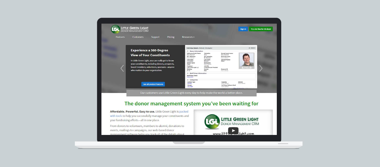
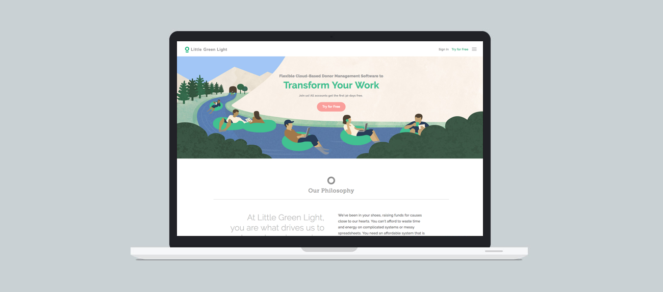
How can a donor management software website better align itself with user needs?
The company was familiar with my work for another client, and wanted to achieve the same findings for what could be done to improve their website. What did their users actually want?
Challenge we were trying to solve:
B2B software company seeking an improved look and feel to their website through user research. Goal was to drive better conversions and more revenue from their site.
The research approach and methods used:
Stakeholder interviews, competitive analysis, heuristic evaluation, user interviews, desirability wordlist.
One or two key learnings:
Users were drawn to three key selling points of the product—integrations, cost, and 3rd party reviews, but some of these key values were not prominently featured on the client’s website. Users by and large would not switch to Little Green Light’s service if differentiators weren’t made clear. Secondary research uncovered best marketing practices for B2B websites which I provided to the client, along with visuals from top companies in the SAAS space including Salesforce.com and Mailchimp.
Research deliverables:
56-slide Google Slide deck, presentation to management, video clips cut from user interviews.
Impact of our research findings on design or strategies:
The website was totally redesigned, and key user values such as integrations were more prominently featured on the new website.
“Jonathan really helped us see our website from our visitors’ point of view. He was extremely results-oriented and professional throughout the entire engagement and delivered more than expected. Highly recommended.”
–Hunter Williams, VP of Product Marketing
Date
July 20, 2015


