How does a large retail clothing company improve their website’s usability?
Challenge we were trying to solve:
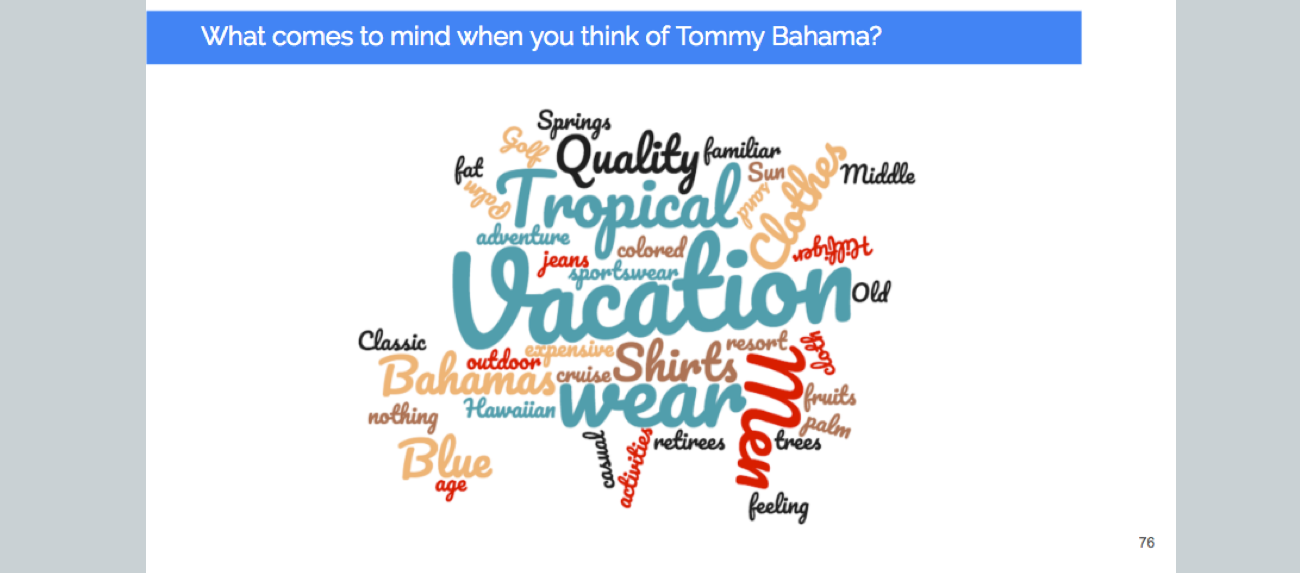
A well-respected clothing brand was seeking research to improve the user experience of their website, TommyBahama.com.
The research approach and methods used:
In-person usability testing (13 people), surveys (1,600 people), card sorting, stakeholder interviews, competitive analysis, heuristic evaluation.
One or two key learnings:
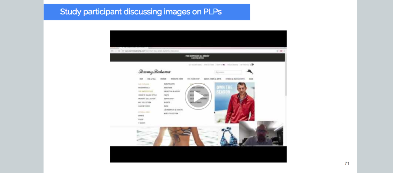
Existing customers generally performed better on our eleven tasks compared to new customers, but all participants uncovered site elements which were frustrating and confusing. This included the menu dropdown, adding an item to a cart (interaction design), and iconography on the product landing page, to name a few. Our competitive analysis of top retail fashion e-commerce companies, including J. Crew and Nordstrom, uncovered best practices in regard to product layout, information hierarchy, and interaction design.
Impact of our research findings on design or strategies:
Video clips from our usability sessions proved particularly insightful in our presentation to EVP marketing, VP e-Commerce, Creative Director, and others. Some simple fixes were made in the experience. Should they choose to invest in the redesign needed to significantly upgrade the user experience on the site, they have a complete list of suggestions and data from which to do so.
Date
January, 11 2017


